Colors are everywhere around us, influencing our moods, decisions, and even our productivity. When it comes to interior design, the colors we choose can significantly affect how a space feels and functions. In this article, we’ll dive into the fascinating world of color psychology, exploring how different hues can evoke emotions and influence the usage of spaces. We’ll also look at some famous examples of buildings where color psychology played a key role in design.
Understanding Color Psychology
At its core, color psychology is the study of how colors affect human behavior and emotions. This field encompasses various disciplines, including art, marketing, and, of course, interior design. Each color has its unique psychological effects, and understanding these can help us create spaces that not only look beautiful but also feel right for their intended purpose.
The Warm Colors
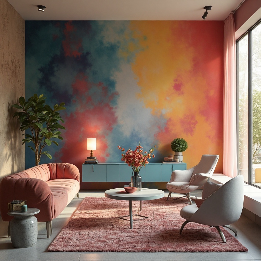
Warm colors—like red, orange, and yellow—are known to evoke feelings of warmth and energy. These colors can stimulate conversation and creativity, making them perfect for social spaces like living rooms and dining areas. For instance, a cozy living room painted in warm terracotta can create an inviting atmosphere, encouraging family gatherings and lively discussions.
However, it’s important to use these colors thoughtfully. Too much red can lead to feelings of aggression or anxiety, while a soft peach might promote warmth without overwhelming the senses. This balance is crucial in spaces where we want to foster connection and comfort.
The Cool Colors
On the flip side, cool colors—such as blue, green, and purple—are typically associated with calmness and tranquility. These hues can help create a relaxing environment, making them ideal for bedrooms and bathrooms. A soft blue bedroom can evoke a sense of peace, helping you unwind after a long day.
Interestingly, cool colors can also promote focus and concentration. A well-lit office space painted in soft greens or blues can enhance productivity while providing a soothing backdrop for work. This is why many corporate offices opt for these colors in their design.
Neutrals and Their Versatility
Neutrals—like beige, gray, and white—can serve as the perfect backdrop for other colors. They provide balance and can make a space feel open and airy. However, neutrals can also feel cold or sterile if not paired with warmer elements. For instance, an all-white room might feel too stark without the warmth of wood accents or colorful decor.
Neutral tones are incredibly versatile, allowing for easy changes in decor without needing to repaint. This adaptability is why many homeowners and designers gravitate towards neutral palettes, especially in spaces like kitchens and bathrooms.
The Role of Lighting
It’s essential to remember that the psychological effects of color can change depending on lighting. Natural light can enhance the vibrancy of colors, while artificial lighting can shift their appearance entirely. For example, a soft yellow can look warm and inviting in daylight but may appear harsh under fluorescent lights.
Designers often take this into account, experimenting with different lighting solutions to achieve the desired effect. Layered lighting—combining ambient, task, and accent lights—allows for flexibility and can dramatically transform the mood of a space at different times of the day.
Famous Examples of Color Psychology in Architecture
Now that we’ve explored the basics of color psychology, let’s look at some iconic buildings where color played a significant role in the design.
The Blue Mosque, Istanbul
The Sultan Ahmed Mosque, commonly known as the Blue Mosque, is a stunning example of how color can enhance architectural beauty and spiritual ambiance. The mosque’s interior features intricate blue tiles that create a serene atmosphere, inviting contemplation and reflection. The calming effects of blue are amplified by the soft light filtering through the stained glass windows, making it a peaceful retreat for visitors.
The Guggenheim Museum, Bilbao
Designed by Frank Gehry, the Guggenheim Museum in Bilbao is a masterpiece that showcases how color can influence perception. The museum’s exterior features a mix of metallic hues that change with the light, creating a dynamic visual experience. Inside, the use of whites and light grays helps to emphasize the art on display, allowing visitors to focus on the exhibits without distraction.
The Villa Savoye, France
Le Corbusier’s Villa Savoye is another remarkable example of color psychology in design. The minimalist white exterior presents a clean, modern look that contrasts beautifully with the lush greenery surrounding the villa. Inside, the use of bright primary colors in certain areas stimulates creativity and joy, reflecting Le Corbusier’s belief in the emotional power of color.
Practical Tips for Applying Color Psychology in Your Own Space
Now that we’ve explored the theory and some famous examples, how can you apply this knowledge to your own home or workspace? Here are a few practical tips:
- Choose Colors Based on Function: Think about how you want to feel in a space. For relaxation, opt for cool colors; for social spaces, consider warm tones.
- Test Colors in Different Lighting: Before committing to a color, test it in various lighting conditions throughout the day to see how it changes.
- Balance Bold Colors with Neutrals: If you love bold colors, use them as accents against neutral backgrounds to avoid overwhelming the space.
- Incorporate Personal Preferences: Ultimately, your space should reflect your personality. Choose colors that resonate with you and make you feel at home.
- Don’t Forget About Texture: The texture of materials can also influence how colors are perceived. Consider incorporating different fabrics and finishes to add depth and interest.
The colors we choose for our interiors do more than just beautify our spaces; they have the power to shape our experiences and influence our emotions. By understanding the psychological effects of color, we can create environments that foster the moods and functionalities we desire. Whether it’s a calming blue bedroom or a vibrant orange kitchen, the right colors can turn a house into a home and a workspace into a sanctuary.
So, next time you’re considering a fresh coat of paint or new decor, think beyond aesthetics—consider the emotions you want to evoke and the experiences you want to create. Your space is a canvas, and with the right colors, you can paint a picture of comfort, creativity, and connection.